Search

marketing snippets

why product managers should care about content marketing

I was excited to present “why product managers should care about product marketing” at Product Camp PDX last weekend. After inspiring product managers to become more market driven for a dozen years as a Pragmatic Marketing instructor I needed my public speaking fix. So I popped up to Portland and proposed my session. Thankfully, I got enough votes to present.

As if product managers don’t have enough to do, I’m telling you to focus on content too? YES!

Discover:

  • Three simple reasons why product managers should care about content marketing
  • Some good content marketing resources
  • Some examples of great content

What is your favorite piece of content and why? Did it inspire you? Educate you? Move you?

Should product managers care about content marketing?

sweet spot of inspiration

I have ideas on what to create, write, or do, but don’t always have the inspiration. Or, I have an idea, I’m inspired, but the topic isn’t interesting to anyone else. Or I have an idea about something to do, I love doing it, others are interested, but I’m not very good.

The sweet spot:

sweet spot


the customer journey infographic

I love great infographics, especially when they illustrate a topic I care about. Seeing complex ideas presented in an appetizing, easily consumed format is so satisfying.

Here’s one I found when I was reading through this year’s Content Marketing Awards.

1-0d507c4d05

I can see why The Customer Journey by IDG Enterprise was a finalist for Best Infographic. There is so much data here, but it is organized in a way that fulfills the subtitle “The Guide to Reaching IT Decision Makers Through Content Marketing.” If you sell to IT decision makers, you ought to click here to get a poster of this and really internalize everything it says. Even if this content isn’t relevant to you, it provides a teaching moment for creating infographics.

My criteria for great infographics:

Educational

This one is abundant with useful information and advice when selling to IT decision makers whether you engage IDG Enterprise or not.

Actionable

Although there is a massive amount of data on this infographic, the clear call to action of “5 Top Tactics – How to Engage ITDMs” engages the reader to take the next steps.

Credible

IDG Enterprise has a strong reputation. But the statistics from their 2014 IDG Enterprise Customer Engagement Survey bring market authority from the respondents, not just IDG Enterprise opinions. The way the statistics are woven into the overall story is masterful, beginning in the introduction and threaded through each of the 5 main points.

Organized

The flow of the infographic starts with the title “The Customer Journey.” Since I care a lot about the customer journey, this is what propelled me to look for this infographic when I saw the Best Infographic award.

The subtitle, “The Guide to Reaching IT Decision-Makers Through Content Marketing” further drew me in. Three things about the subtitle hooked me:

  1. Guide: This is intriguing because it infers educational and actionable.
  2. IT Decision-Makers: This is a persona I marketed to for years, across different industries. Although many things change depending on industry and type of problem you solve, there are a lot of similarities that cross industry and problem.
  3. Content Marketing: This has been a passion of mine for a long time, especially in the last few years.

The subtitle alone is a trifecta for me.

Then, the introduction starts with “The Challenge.” LOVE it! “What problem are you trying to solve?” is one of my all time favorite questions. When you state the challenge, you draw in those who know they have the problem, and can intrigue those whose problem is latent.

Down to the body, the reader is walked through the 5 groups of information, finishing up with the clear call to action. Without a strong organization, your eyeballs would have been spinning on the top third of the infographic. As it is, there is a lot to digest in one sitting, but you can easily come back to where you left off to absorb more after you’ve taken a breather.

The information is scannable (where I can hone in on interesting “chunks”) with multiple points of entry. I can move from left to right consuming each morsel step by step, or I can scan down the first column for the highlights of the 5 groups, and go back up again through the details.

Creative

Although extremely busy, the use of color, typography, icons, and the hand drawn touches all work well to take the reader on a journey through the information. The first 5 steps are colored blue (this is the main body of information) and the conclusion is orange which leads your eyes to the call to action.

A bonus for creative would be creating a chart or graph where the shape reflects the context of the statistic. The Customer Journey infographic doesn’t have any, but here is an example:

21_infographics

Do you have any great infographic examples? Post them in the comments along with why they are great.

best content marketing advice

My love-a-meter for content is high when I think, “Dang, I wish I’d thought of that!” That’s what I thought when I saw this infographic from Curata.

They posed this question on the LinkedIn Content Marketing Forum:

“In just one sentence, what is your best content marketing advice?”

Great question. But cooler than that is the infographic they created to summarize their findings. All of which I wish I’d said.

advice-infographic

Check out the rest of their post and comments. Good stuff. And ask to join the Content Marketing Forum on LinkedIn. I just did. Hope they let me in!

content is fuel

Content marketing started for me back in the 80’s. Long before the term was coined. I had a complex product that did anything and everything for companies that made widgets (tech, consumer, and anything a manufacturer might regularly ship to their distributors to meet ongoing demand). Because it did so much, it was hard to describe in 25 words or less.

My background was education, not marketing. But one day as I was trying to write something to describe what our product did, a big lightbulb appeared above my head.

raspberry-lightbulb

I started writing a story. A “case study” of a robotics company and the key challenges they had that my product would solve. A narrative sprinkled with screen shots illustrating how our product would be used to solve those challenges. Mind you, this was done in courier font on an impact printer with dot matrix screen shots pasted (literally, not with the computer). Before we had our first fat Macs with Word, MacPaint, and MacDraw.

This case study (all fictional) had examples of the reports they would see (which back then was a big deal), some diagrams to illustrate the life of a sales order, but more importantly told a story that resonated with our buyers.

We spiral bound that document and used it in our marketing and sales efforts with great success. Parts of the story resonated early in the buying cycle for buyers who didn’t realize there was even a product that would solve their problems. The sample screens and reports (in context, not in isolation) answered questions for buyers later in the buying cycle. Boy, I wish I still had a copy of that pre-e book.

Back in the last millennium in 1992, the Dockers® brand at Levi Strauss created the Guide to Casual Business Wear that was mailed (yeah, before ebooks) to 25,000 HR managers. Dockers had been on the market since the 80’s, but in the early dot com era of the early 90’s, employees were embracing Aloha Fridays wearing Hawaiian shirts and flip flops to work. The pamphlet addressed a concern about casual dress impacting productivity and gave HR tools to guide employees on what was appropriate casual wear. According to the Levi’s website, “Dockers was hailed as revolutionary for creating a cultural shift that propelled their khakis into the mainstream.” Levi’s doesn’t say whether their sales improved as a result of the pamphlet, but it was educational, valuable content for the HR persona that helped them deal with a growing problem in a professional manner. Practical, relevant content. That likely sold more Dockers.

When I first stumbled across content marketing as a discipline, I immediately got it because I had been doing it. I love what the godfather of content marketing, Joe Pulizzi and Content Marketing Institute have done to crystalize the power of content marketing. Here’s a fun infographic from Content Marketing World 2012 illustrating a brief history of content marketing.

Brief-History-Of-Content-Marketing-Infographic-infographicsmania

content marketing machine ebookHow to Build and Operate a Content Marketing Machine written by Marketo and Kapost is a great illustration and explanation of creating a content marketing machine.

This was written back in 2012 and although many new tools and techniques have been developed over the last three years, this ebook continues to be a must-have guide for creating the content marketing machine.

Machines are great. Making things repeatable, sustainable, and scalable. Machines are essential to do that. But…

Relevant content is the fuel for the marketing machine.

customer-journey

Content marketing isn’t just feel-good stories to drive awareness. Ultimately, content marketing should engage buyers throughout the customer journey, moving them along to ultimately buy and consume our products and services. And content relevance depends on where the buyer is on that journey.

What was brilliant about the Dockers pamphlet was their understanding of the HR persona (an influencer, not buyer of their products). With HR sanctioning khakis as appropriate for Casual Fridays, employees (the buyers) would consider Dockers when purchasing their casual wardrobe.

In a future post I’ll give examples of different kinds of content that can help buyers navigate the customer journey leading to more business.

And as I said before, relevant content is the fuel for the marketing machine. Worth repeating.

content marketing machine no border

A great ebook or blog post or tweet or video or story or infographic or testimonial: these are all fuel that is essential to run the machine, as long as the fuel is relevant to the buyer, at the right time in their journey, in a place they will find it. In the olden days we used to call this approach “integrated marketing.” Don Draper knew about content marketing back in the 60’s. (I know it’s TV, but you know what I mean. Go back and watch it on Netflix, a master of content.)

To be successful at marketing, at content marketing, at business, it is essential to get inside your buyer’s head. To know and understand them better than they know and understand themselves. This is the key to creating great, relevant content that will inspire and engage them, leading them to buying and using your products and services. My robotics case study worked because I understood the problems my buyers had, and how my products and services would help them address those problems.

Checkout

If you’re interested in learning more about how you can create a content marketing machine, contact me. I’d love to help.

using themes in PowerPoint

colour-pencils-450621_1920

In my last post, I defined the basic differences between themes and templates in Microsoft Office apps. Over the next several posts I’ll talk about how to use them to create a polished, professional looking presentation. 

I use Microsoft Office 2016 for the Mac. Instructions might vary for you if you are using a different version or platform. If you want to see a larger view of any of these screen shots, simply click on the image.

Applying the theme

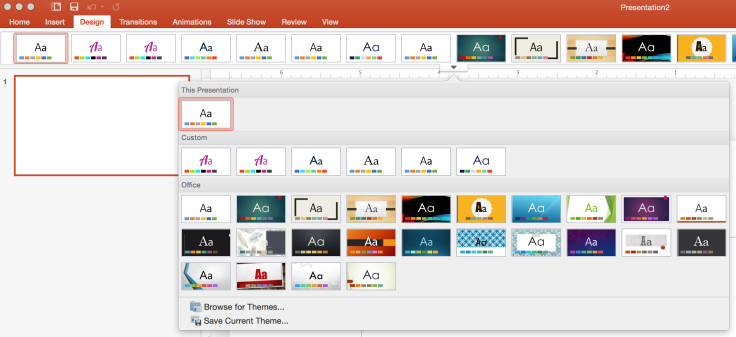
Let’s start with something simple by creating a new blank presentation.  Once you create a new presentation, select a theme from the Design tab to apply one of the built in themes.

select theme

apply template
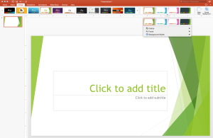
Here I have chosen the Facet theme. The slide now has green, triangular shapes framing the title block.

Below, notice different color variations of the theme to the right of the themes on the Design tab. (Not all themes have these variations, but when they do, it provides another way to customize the theme.)

change colors

Below I have opened an existing presentation and applied the darkest version of the Facet theme.

changing templates

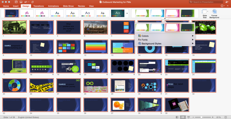
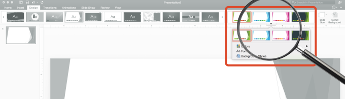
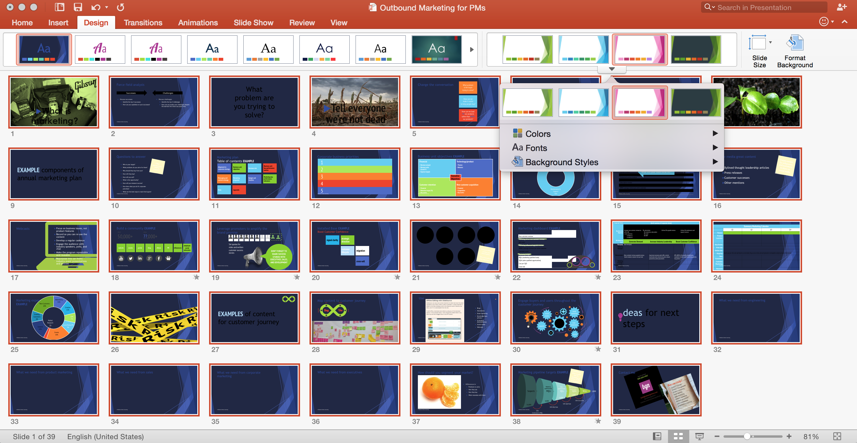
If you use the Slide Sorter view, you can quickly see the impact of applying a theme to an existing presentation. You can change the color palette, fonts, and background styles, also. (More on changing these in the slide master below.)

Theoretically, applying a theme shouldn’t take a long time. But you have to look at each slide to see what effect the change makes. Remember that a theme can contain colors, fonts, and background styles that are likely different from the presentation you’re updating. Look for:

  • Word wrapping: Since letter sizes vary from font to font, text will not wrap the same for every font.
  • Colors: When you build a presentation and assign colors, if you choose colors from the theme colors, PowerPoint assigns a color slot rather than the actual color. For this example, the raspberry color that is highlighted is the second dark text/background color in this theme (column 4).theme colorsIf I change to a theme where the first color in the 4th column is dark blue, everywhere in the presentation where I assigned the raspberry in the 4th column would change to dark blue.Wherever you see colors that don’t change when you apply the theme, check to see whether you applied a “Standard Color” or “Recent Colors” that are outside of the Theme Colors palette. Even if they have the same value (such as the RGB numbers assigned to the color), if they were not assigned from the theme colors, they will not change when you change themes.Also, look at objects that were created outside of PowerPoint. Do the colors work with this template? You may need to go back to the source file (such as Illustrator or Photoshop) and use a different color scheme to match your new template.If you are changing from a white background to a colored background, objects may need to be changed to look good. Especially if you have a photo with a white background making the object look cut out. You may need to change the photo background to transparent rather than white to look good on a dark background. OR, maybe it is better to select one of the white backgrounds for an individual slide so it looks right.

    For example:  Before  Before   After After

Creating a slide master and slide layouts

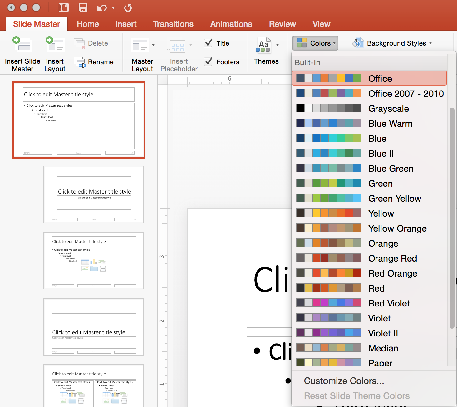
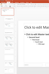
Slide masters and layouts help you add a designer touch to your presentations beyond colors and fonts. To see the slide master and layouts in your presentation, go to the View tab and select Slide Master.

plain slide master and layouts

From the Slide Master tab you can choose the theme colors for this master.

choose your theme colors

You can also choose the default fonts for the heading and body text of your presentation.

fonts copy

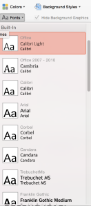
You can customize theme colors and create new font pairs* to further tailor your theme.

Each slide master has multiple layouts for presenting different types of content such as graphs, photos, bullet slides, and tables.

TIP: If you want to change the title and content formatting for all layouts, change it on the first slide which is the master layout.

Advanced tips

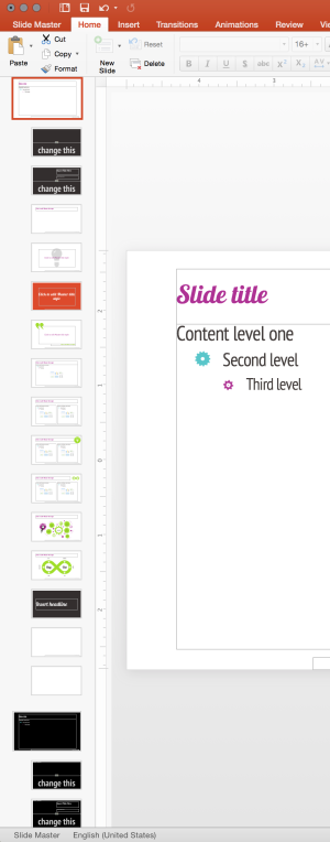
Multiple slide masters

For each slide master you can apply a different theme, different theme colors, and different fonts. One way to use this feature would be to create different background colors depending on the type of room you’ll be in. When you’re in a smaller, well-lit room, a light background is easier to read. In a larger keynote ballroom or auditorium where the room may be darker, a dark background works well. Although Guy Kawasaki says go big and go black (implying ALWAYS), it really depends on the venue and the types of slides you’ll be presenting. I love rules, but I also love breaking rules when it makes sense. Sorry Guy.

Here are some of the layouts in one of my themes.

multiple masters

To create the second slide master (black), I copied the first one (white) and pasted it at the end. That created the same set of slide layouts, with the same names. This makes it easier to switch back and forth between masters without having to do a lot of manual application of the slide layouts.

Then on the first slide (the master) I changed the background from white to black and fixed the title and content font colors to white (I was hoping PowerPoint was smart enough to switch to the light color, but it didn’t.)

Because I designed this presentation with a white background to begin with, some of my graphics didn’t work that great just switching from white to black. I had to manually tweek many of the slides and some images just didn’t work.

Creating unique layouts

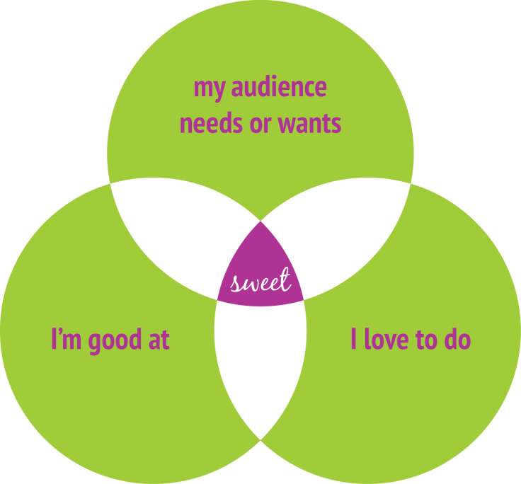
I like adding some graphical elements that act like sign posts indicating what type of content the viewer is seeing. Although most of the themes that are included with Office have a lot of graphical elements on the slides that are decorations rather than meaningful (like Facet in the example above), I like more simplicity on my slides so the decorations don’t compete with the content. For example:

layouts

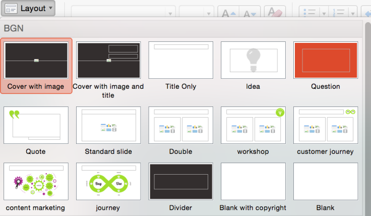
I typically don’t like to clutter my theme with a lot of content slides even if the content will be used in multiple presentations. Those belong in templates (more on that in a future post). But you may notice my content marketing and journey slides above. The reason I put those in my theme is because I occasionally make revisions to these diagrams that I often use in my presentations. By putting these as slide layouts, I simply need to modify the layout, save the theme, and apply the new theme to any presentation using these slides.

For a PowerPoint ninja like me, I am very excited by a new service I am using that solves this problem in a different way. It is called SlideSource and each slide in your presentation becomes an object that can be used in multiple presentations. If you need to change it, you change it once and any presentation using that slide can be updated to use the new version. I haven’t completely changed my habits yet to take advantage of all of the capabilities of this cool product but hope to write more about it in the future.

Other useful links about themes:

All about themes, Quick Styles, cell styles, and background styles

What is a slide master?

Footnote* Creating new font pairs (for heading and body) does not work right now on PowerPoint 2016 for the Mac. My workaround for creating new font pairs so they will appear in the list of Custom fonts is to do it within PowerPoint on a PC, save the xml file with a name easy to find, copy the file to my Mac, and put it into the Theme Fonts folder which is not that easy to locate. Klugy at best. If I try to modify the xml file using the text editor on the Mac, it does something to the xml file that causes the changes to be ignored.
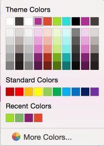
themes, templates, and whiches

which witch is which

It is easy to get confused with themes and templates in Microsoft Office apps. Which is which (not witch) and which should I use when? (I know this is a lame connection to Halloween which is around the corner, but it seemed like a good idea at the time. And I liked the hat.)

Definitions

Themes can be used across documents (such as PowerPointWord, and Excel) to create a consistent visual identity. Elements included in a theme are:

fonts-colors

For PowerPoint, themes can also contain background styles and slide masters/layouts.

Several themes are included with Office, and you can modify them or create your own for a custom look.

themes

Templates are created and used in the specific program (such as PowerPointWord, and Excel) as a starting point for different types of documents. Unlike themes, templates can include your content (boilerplate text, logos, and other common content). Like themes, several templates are included with Office. Within a template, you can assign a theme which would have your fonts, colors, and object effects.

You will see all available templates when you open the program and create a new document. I encourage you to check out the templates to give you ideas for own your business.

Word templates:

Word templates

Excel templates:

Excel templates

The templates included with PowerPoint are mostly slide designs without a lot of varied content.

PowerPoint templates

When I create PowerPoint templates, I include common content I will use in multiple presentations that would otherwise clutter up the slide master/layouts.

Stay tuned. I will walk through how to use themes and templates in upcoming posts.

% increase between two numbers

%increase

Why can’t I ever remember how to calculate this? I finally created a cheat sheet in Excel so I don’t have to do the math manually.

I’m not sure how to express this in common core math. I like Excel better…

3 steps to becoming a more persuasive speaker by renovating crummy PowerPoint slides

piranhas-123287_1280

I’m not one of those militants who always want to ban PowerPoint. I know there are really bad presentations being given every hour of every day, everywhere. But that’s no reason to dump presentations.

It’s all about choice. When you’re giving a presentation that uses bad PowerPoint slides, you’ve chosen not to pay attention to an important piece of the whole package to persuade your audience to do something. If that’s not what you’re trying to do, why are you even speaking? If you’re a good speaker, you might figure the slides don’t really matter. You’ll muscle through, mumbling about how this slide or that is an eye chart and that the audience shouldn’t pay attention to it.

Pay no attention to the man behind the curtain.

Well, bad slides are distracting. When you have a slide full of words, the audience will try to read them instead of listening to you. THE SLIDES ARE NOT A TELEPROMPTER!!! Or if the words are an eye chart, they’ll check out, get on their phones, and do something else.

You know this. Stop choosing to ignore the problem.

Here are 3 things you can do today with your next PowerPoint deck to begin the transformation of using your slides to tell your story persuasively.

Step 1

Problem: “But, Barb, the reason I have all of that in the deck is for the handout. The audience needs this information as a reference.”

REFERENCE MATERIALS DO NOT HAVE TO BE ON SLIDES YOU PROJECT!!! (Sorry I keep yelling, but I’m passionate to fix this problem.)

A simple fix: Add an appendix or reference section at the end which you will not present but will be part of the handout and put the dense slides there. Or better yet, create a Word document “report” of the findings. It’s a lot easier to format anyway. Then, in the main part of your presentation create a slide with visual interest and maybe a headline that reminds you of what you want to say. If you need a teleprompter, it’s OK to refer to notes when you get to that slide. But DON’T project the notes!

Step 2

Problem: “I’m usually building the slides at the last minute and don’t have time to do anything fancy.”

How important is the presentation? Is it to your team? Your peers? The executives? Customers or investors? Your presentation skills create an impression. When you stumble through, or read to your audience, they are not very engaged.

A simple fix: You’d be better off printing your slides 2 per page. Cut them in half. Collate them and use them as notes. Don’t turn on the projector at all. (OK, sometimes you should dump PowerPoint.) Speak directly to your audience in earnest. After the presentation, give the audience a PDF of the material if it contains information they need to retain.

Step 3

Problem: “My audience wants data. My credibility is at risk if I just put up pretty slides.”

Your audience is human. I’m not saying to eliminate the data. Think of this as food presentation. Isn’t a meal more appealing when the food isn’t just dumped on the plate?

A simple fix: Take the time to figure out what story your data is telling. Numbers and facts without the story of what they mean will not persuade. And always compare the results to something tangible.

You can read to your audience:

Screen Shot 2015-10-16 at 11.20.17 AM

OR you can tell a story while you build the slide, ending with compelling results. (The grey numbers indicate how you would build the slide.)

Screen Shot 2015-10-16 at 12.01.23 PM
If your audience wants the gory details, create a visually appealing dashboard (more on that in a future post).

Stay tuned for more ways to make your presentations more compelling.

Blog at WordPress.com.

Up ↑